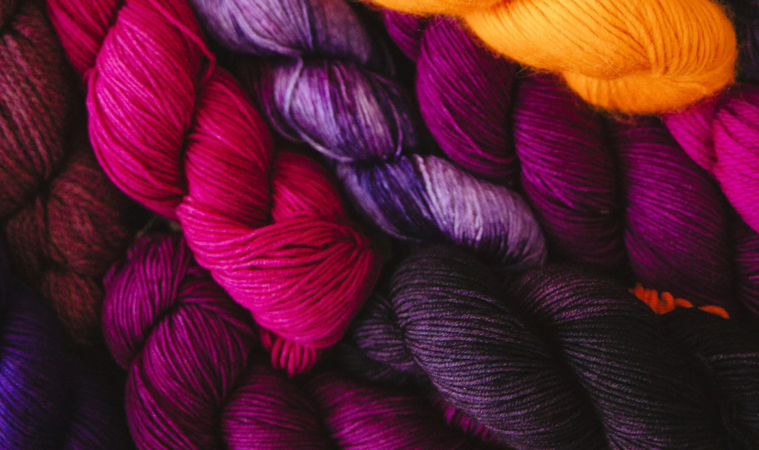
The colors you choose for your brand are often the introduction to your visual brand story. If done right, your colors will be a quick identifier that someone is looking at your branded content. Additionally, your brand colors can connect you with your audience and help them not only start spotting your content and patterns a mile away but also engage emotionally. Today, we’ll explore the psychology behind colors and how you can use color to connect with your audience; What certain colors say to your audience, and how they can help influence buying choices.
As always, these things should be looked at as an added tool in your toolbox and not the be-all and end-all for your brand choices. We’re not saying you should switch your brand colors or on gosadi for example, your Designer Landing Page (DLP) to be blue to drive customer loyalty if that doesn’t align with you. We are saying to take a deep dive into finding the colors that tell your brand story and connect with your audience. …so if you’re looking to build a logo for your brand could adding blue be the right choice for you?
Let’s see if the colors you love are helping you tell the story you want to tell.
Learn more about The Art of Impactful Storytelling with Jessica Brist
decoding & understanding color psychology
Colors are more than aesthetic choices; they hold the power to shape perceptions, trigger emotions, and influence actions.
It’s no secret that successful marketing requires a strategic use of colors. Color psychology plays a pivotal role in how customers respond to campaigns. Each color carries its narrative, whether we see it on the surface or not. Understanding this spectrum of emotional triggers is key to connecting with your target audience.
exploring the color spectrum
Understanding the meanings behind different colors is the first step in creating a palette that speaks to your brand’s narrative. Today we will delve into a few common colors and their significance while also looking at the popular brands who chose to use these colors in their marketing.
red:
Symbolizing bold energy, love, strength, and excitement, while commanding attention. Red is a dynamic choice. Think about the feelings you might have towards brands like Netflix, Coca-Cola, and Colgate. While Netflix leans into the excitement and adventure that the color can stir up, Coca-Cola uses it to connect to their buyers’ search for an energy boost.
blue:
Associated with loyalty, trust, competence, confidence, professionalism, reliability, and peace of mind. Examples of blue brands include Chase, Visa, Ford, and American Express.
It’s almost shocking when you think about how many financial institutions use blue in their branding. It subconsciously builds a feeling of trust with the viewer that is critical for brands like this.
green:
Evoking freshness, healing, nature, and quality, and aligning with sustainability. Examples include Sprite, Subway, Whole Foods, and Land Rover.
Whether these brands align with these topics or whether they want you to feel that they do, it is interesting to see how color plays a role in your perception of a brand. Sprite & Subway use green to position themselves as “healthy alternatives” to their competitors while Land Rover uses it to drive home (pun intended) their customer’s daydreams about off-roading trips in nature.
yellow:
Radiating warmth, happiness, friendship, and creativity, yellow brings a burst of positivity that can differentiate your brand within the competitive landscape. This seems to be a popular color among fast-food chains for these exact reasons. Examples include Lays, McDonalds, Cheetos, and Denny’s. But this also includes brands that want you to feel relaxed and comfortable like Ikea, Hertz, and Western Union.
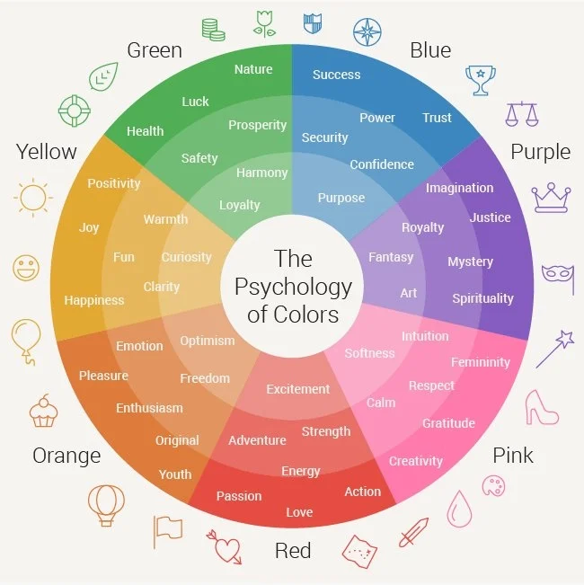
orange:
Standing out with associations of courage, confidence, speed, playful fun, and success, orange adds a vibrant touch to your brand’s story. Brands that have run with this color include Amazon, Harley Davidson, Shutterfly, Mastercard (which also used red & yellow see above), Bitly, and Dunkin’.
purple:
Rooted in historical associations with creativity, quality, arts, royalty, honor, leadership, and spirituality. It’s funny to start off with the example of Hallmark which also went as far to include a crown as their icon. But other examples of purple brands LA Lakers, FedEx, Lady Speed Stick, NYU, the Syfy network.
Purple’s connection to the arts, creativity, and leadership are some of the inspirations that lead us to choose it for gosadi.
black:
Conveying drama, security, formality, and sophistication. You can see this in action in many fashion brands and brands that want you to view them as institutions such as Prada, Apple, Chanel, Zara, the BBC, and Lancome Paris. Brands that use black are saying that they don’t need to call attention to themselves because their reputation speaks for themselves.
white:
Symbolizing innocence, honesty, cleanliness, and simplicity, white offers a canvas of transparency and simplicity. Brands who are using white as their color accent include Facebook, Samsung, Google, and Apple. It is also interesting to view which colors white is paired with to see more of the story the brand is attempting to tell.
Again, whether you believe that these colors align with the feelings you have about the brands is a different conversation from what stories these brands are trying to convey.
applying this to your brand
Take a minute to think about your brand and the role color plays in how you reach your audience. Then revisit the color list above. Do you identify with colors that represent your brand personality? Do you use colors that speak to your target audience?
It’s important to check that the narrative you decide to craft for your brand resonates with your community. By selecting the right colors, you’re ensuring that your brand speaks the language of your target market.
Take a look at the colors you’re actively using in your social media posts, website, DLP, and even in the samples you decide to photograph for your patterns. How do they align with the examples in this post?
Understanding why you are drawn to a particular set of colors can inform your brand, design choices, and give you a deeper understanding of yourself!
Let us know in the comments how you connect to the colors you use as a designer.