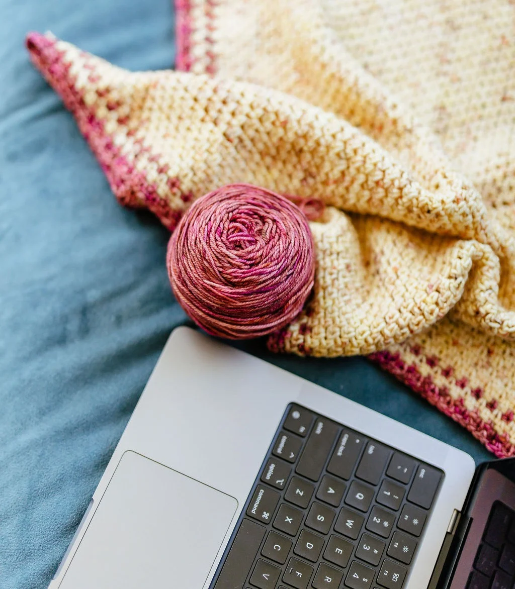
When you think of successful global brands like Apple or Dunkin’ Donuts, there are certain visual elements and tones of communication that instantly come to mind. You’re not just picturing a product or service, but an entire sensory experience associated with that brand. This kind of robust and memorable brand identity is not a coincidence, but the result of a meticulously crafted and consistently followed tool called a ‘Style Guide.’
If you’re new to branding or even marketing in general, you might be wondering, “What exactly is a Style Guide, and why is it so important?” If you are familiar, as an independent designer, you may be wondering, “Why do I need a Style Guide?” Buckle up, because you’re about to discover a game-changing tool for successful branding that will also help improve your efficiency.
What is a Branding Style Guide for Knitting or Crocheting Pattern Designers?
At its core, a branding style guide is like a playbook for how your creative identity shows up in the world.
For knitting or crocheting pattern designers, it’s more than just choosing pretty fonts or favorite colors. It’s about creating a consistent look and feel that ties your patterns, social media posts, and even the way you write instructions together into one recognizable voice.
Think of it as a roadmap that makes sure every chart, photo, or pattern layout reflects the same polished brand your audience can instantly recognize and trust.
Why Do I Need a Branding Style Guide as a Knitting or Crocheting Pattern Designer?
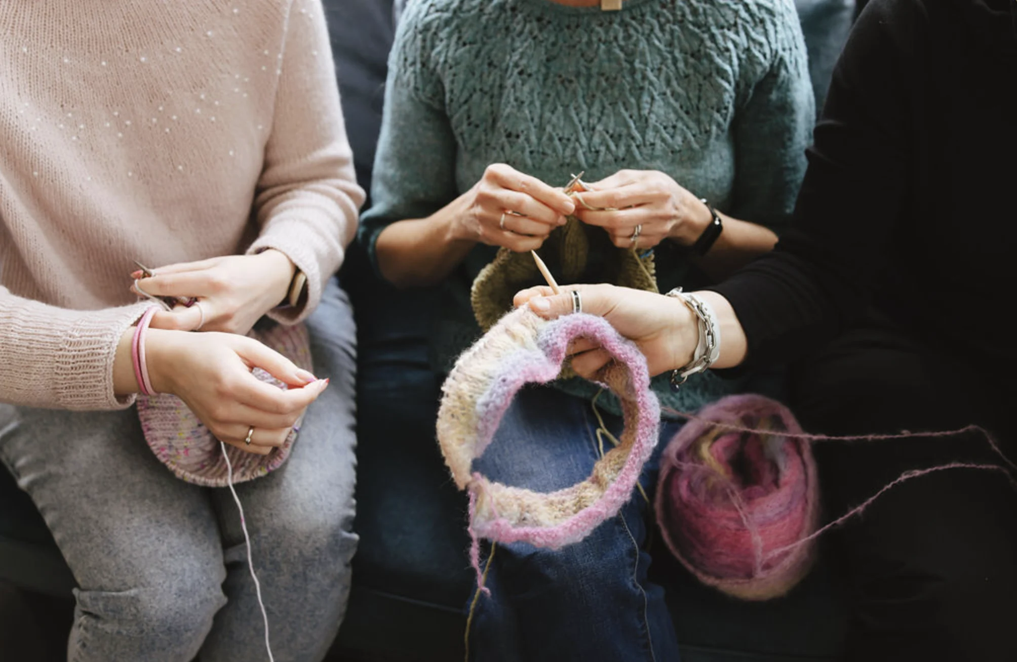
As a knitting or crocheting pattern designer, your work is more than the stitches on the page. It’s an experience you’re creating for knitters or crocheters.
A branding style guide helps you package that experience in a way that feels professional, polished, and uniquely yours. It ensures that no matter where someone encounters your work—whether it’s on Ravelry, Instagram, or in a PDF download—they immediately recognize it as yours.
Beyond building trust and loyalty with your audience, a style guide also saves you time and energy. Instead of reinventing the wheel with every new pattern or post, you’ll have a ready-made set of guidelines that keep your branding consistent and your workflow efficient.
Creating a Style Guide for your brand that can be used on patterns and product descriptions is an easy way to save time and develop consistent branding. It is also a great tool if you work with a VA (virtual assistant) or Tech Editor to maintain consistency in all your work. Here is an easy checklist of key items you’ll want to include in your Style Guide:
1. logos
Keeping your logo consistent across all of your patterns and products is the number one rule of brand consistency. This includes colors, proportions, and how/where it appears.
2. other brand-related graphics
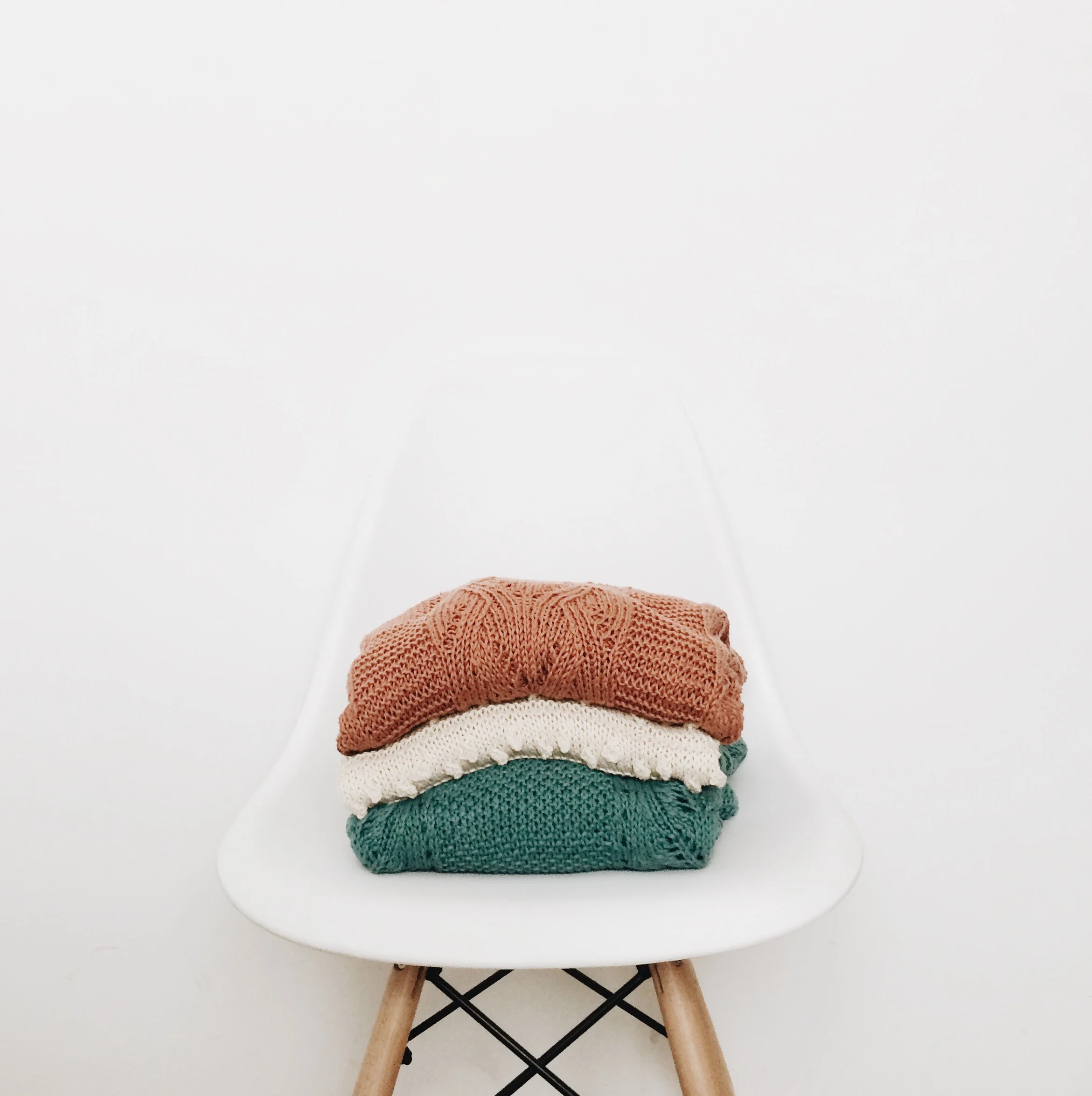
Any other graphics that are part of your brand should also be consistent. Include in your pattern Style Guide how and where these are used. Include things like: sizes of images and placement; borders and collage layout, etc. Don’t forget to include your color palette as related to images and graphics.
3. fonts
There are so many options for fonts and families that it is easy to get off track. Creating some guidelines will help. Questions to ask: Are you sticking with one font family and using variations of that (ie, bold or italic) only? Will you use one font family for paragraphs and a different one for headings? Are uppercase and lowercase being used consistently? Once you land on what you want, create a brand Font Guide within your pattern Style Guide for consistent branding.
4. titles & headings
Rules about consistent font leads into the discussion of consistent titles, headings and subheadings. What font are you using for these and is it always the same one? What size are they in comparison to each other and to your paragraphs? Is one (or more) of them a specific color or always in bold? Create a page or two and decide which best relates your brand voice then add that to your Style Guide.
5. paragraph formatting
You have so much freedom here to format your patterns and products as you like, but you want to make sure it looks uniform each time. For example, is punctuation used in some places and not others, and is there a reason for it? Do you use bullet points? Do you tend to write out words or use abbreviations? What symbols do you use to denote a repeat in your patterns? Are full sentences always used?
6. text and descriptions
Even though your visuals play a big role in branding, the way you use text across your patterns and product descriptions is just as important. Consistency in language not only makes your patterns easier to follow but also reinforces your brand’s personality and professionalism.
Setting a few clear rules around how you handle text will help knitters know what to expect each time they pick up one of your designs.
Abbreviations
Decide on the abbreviations you’ll use and stick with them. Whether you prefer “sts” or “stitches,” choose one and keep it consistent throughout your patterns. This avoids confusion for knitters or crocheters and makes your work feel polished and reliable.
Sizing Information
Sizing is one of the most critical parts of any knitting or crocheting pattern, and presenting it clearly can make or break the knitting experience. Determine how you’ll write sizing information (for example, from smallest to largest, or with chest measurements first). Keeping the format uniform helps knitters or crocheters find the details they need quickly without second-guessing.
How to Phrase Text
Your writing style is part of your brand’s voice. Will you write instructions in full sentences, or keep them short and direct? Do you prefer a friendly, conversational tone or a straightforward, technical one? Defining these choices ensures that your patterns read consistently, which helps knitters or crocheters feel comfortable and confident following your directions.
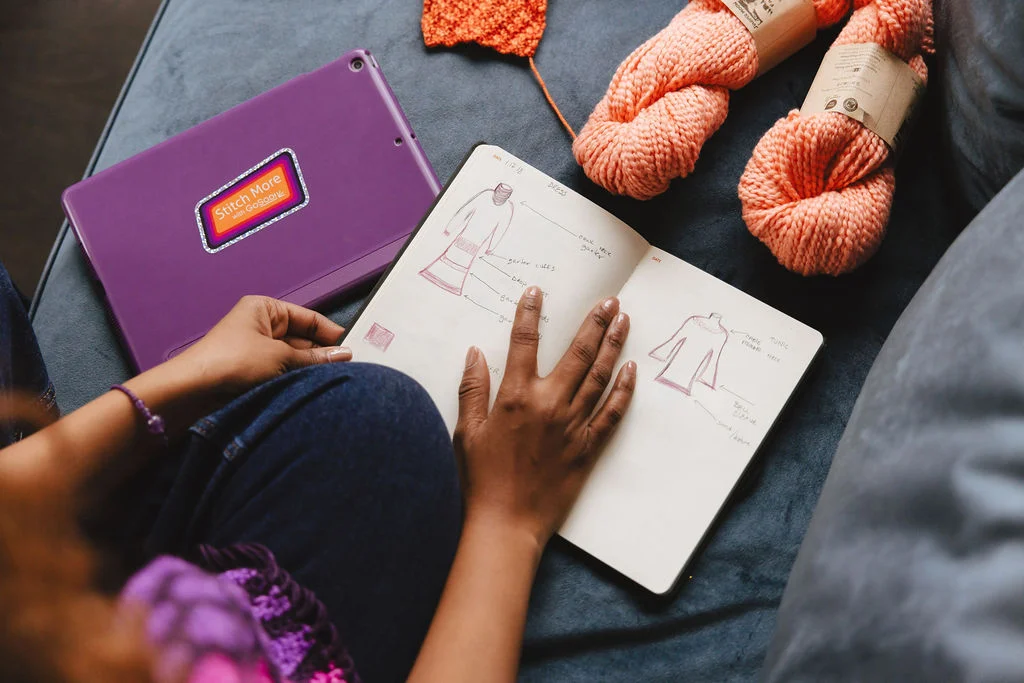
7. images
Your photos, charts, and other images should have branding guidelines as well. Do they always appear on a certain page of your pattern? For photos, do you want to stick to a certain shape and/or aspect ratio? What details pertain to your charted instructions or diagrams that you should keep the same each time?
8. copyright
This is important information that should be a part of every pattern you’ve designed. Equally as important is that it appears consistently across all of your patterns.
9. negative space
This refers to all of the space surrounding all of the elements we’ve already discussed above. Is spacing consistent after your headings? After each paragraph? Surrounding your images?
10. margins & more
Margins are easy to set as a template, so find what works for you and use it all the time. Page numbers are also something to consider, so what font, size, and color are these, and where do they appear? Look through some of your patterns to find what you haven’t addressed yet and add it to your Style Guide.
11. overall layout
The overall structure of your pattern is just as important as the details within it. A clear, consistent layout makes it easier for knitters or crocheters to follow along and reduces mistakes.
Think about how you’ll organize pattern elements like stitch counts, repeat sections, and pattern milestones. For example, will you highlight repeats with bold text or set them apart in a separate line? How will you mark progress points, like when a sleeve is complete, or a chart section is finished?
Creating a predictable structure allows knitters to quickly recognize where they are in the pattern, making the knitting or crocheting experience smoother and more enjoyable.
At its core, a Style Guide is a document outlining your branding rules, and it contains everything from the exact colors and fonts used in a logo to the tone and voice used in written content. It’s a playbook that ensures consistency across all communication and marketing materials, from website design and social media posts to email newsletters and packaging.
By asking yourself the questions above, you can create your own Style Guide and be set up for successful and consistent branding.